Truss (formerly Creator Collective)
Product Design | January 2022-Present
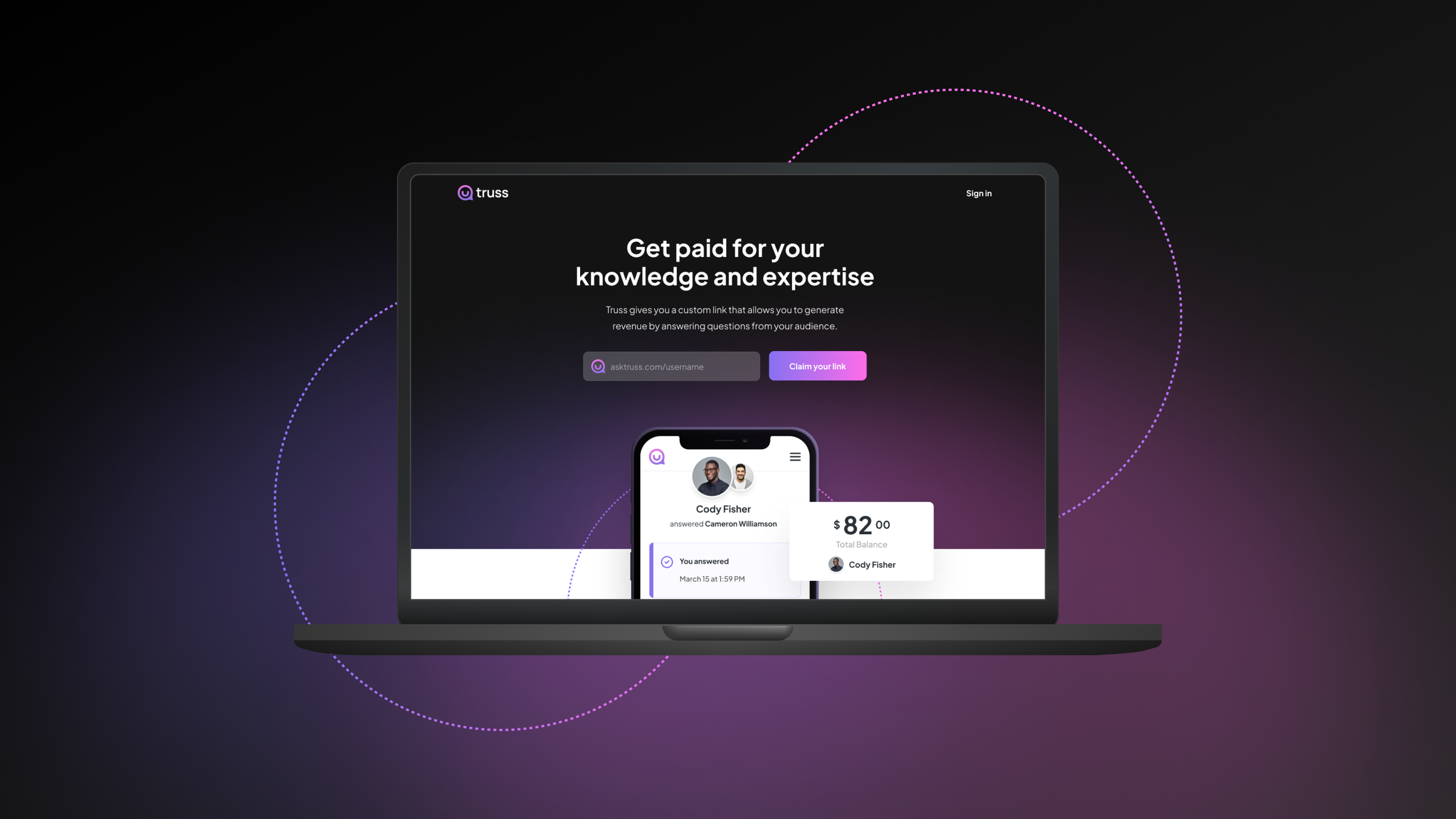
Truss is a platform that enables experts to monetize their knowledge and experience through instant advice and premium mentorship.
How it works:
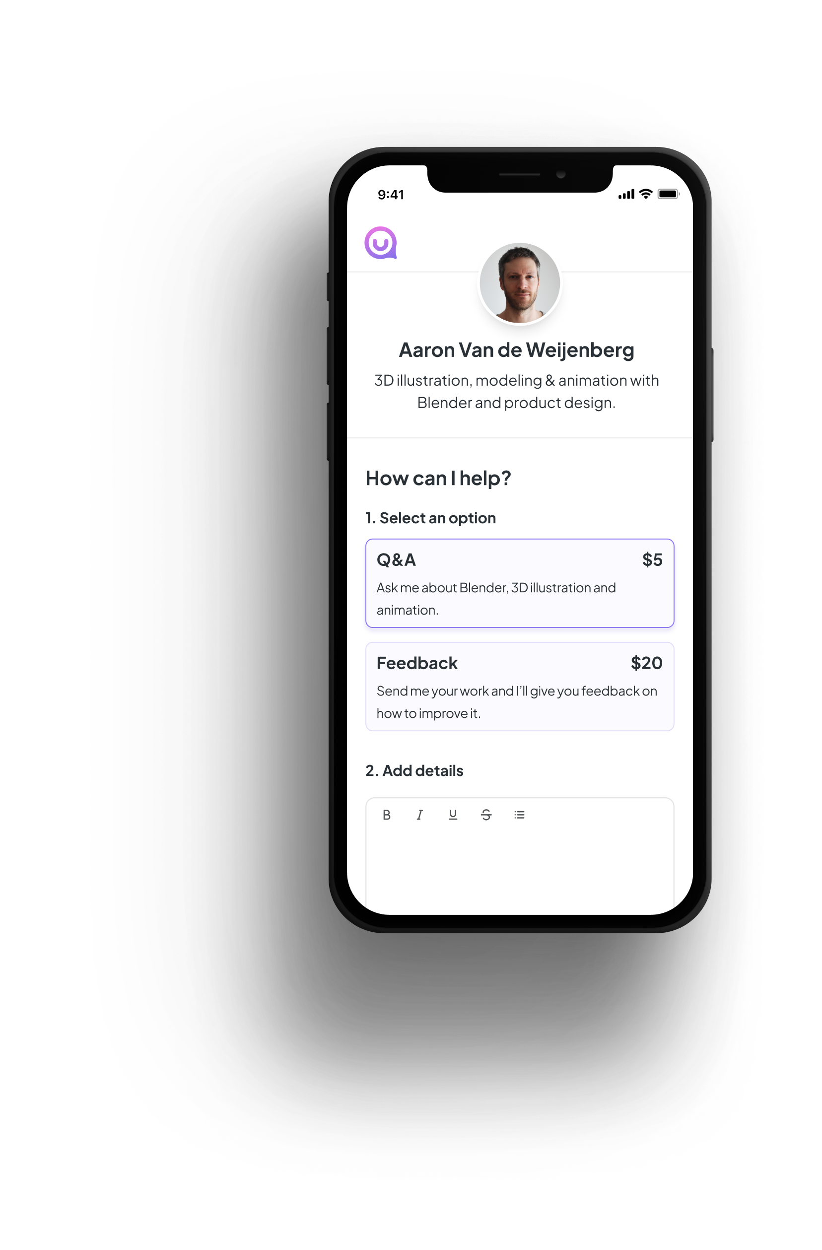
Expert signs up on Truss, creates a profile, and creates a custom vanity link to post to their channels.
Expert markets their service offerings to their channels to gain customers.
Expert’s audience can click the link and immediately book their services.
Important Note:
This case study is a continuation of the Creator Collective case study. I highly recommend reading through it first.
Introduction
My Role
I served as the lead designer on this project, owning each step of the design process from start to completion. I collaborated with engineering, product management, data science, UX research, and business stakeholders to build a user-centric experience.
The Vision
Build a simplified service platform to enable subject matter experts to monetize their knowledge and expertise from their audience’s interactions. All the while supporting the flip-side of the market by providing direct access to trusted mentors.
Background
Through 2021, we did a lot of testing and gathered data to support that Creators are looking for personalized advice and coaching in different areas of their business.
We have gone through a phased strategy of discovery to understand the main problems creators face. We have used these insights to develop ideas for solutions and tested prototypes with different segments of the creator audience.
Product Discovery
We have a lot of testing and research data to support that Creators are looking for personalized advice and coaching in different areas of their business.
MVP 2 Insights
MVP 2 was service marketplace for premium 1:1 mentorship. A stepping stone for us to build an in-house product. To maintain velocity and keep costs low, we presented our users with a no-code, out-of-the-box solution.
It allowed us to test:
Transactions between Creators and Experts
Willingness to pay
The Truss Pivot
After testing out MVP2 we found that the service marketplace format was not the right execution for the product. Too many factors were out of our hands which made the platform complex and confusing for users.
Who people learn from really matters, we struggled to gain our users’ trust with the experts we onboarded to the platform. They were presented with a variety of experts but very few actually went through to pay and book time with the high price points on display.
As a team, we had many conversations around how we could improve the experience. A key factor in all those conversations is that we all firmly believed there was a problem to be solved but that our execution wasn’t hitting the mark.
How can we simplify things…?
What if we created a platform enabling subject matter experts to create and a profile and build out their own custom services. In turn, our product would become a tool for users to market themselves to their audiences with their services. On the flip side of the market, users would access these services directly from the experts’ channels rather being supplied from our own pool of mentors.
MVP 3: Instant Coaching Landing Page
Overview
This landing page was intended to be a marketing MVP. We used it to build and engage with a pre-launch audience to help drive conversion for our public launch.
It allowed us to test:
Product value proposition
Product messaging
Product positioning
Target audience validation
Main Objective
Drive signups for an instant coaching solution that allows users to signup for a pre-launch of the initial product. This MVP focuses on a Q&A format to gauge if quick knowledge transfer is an attractive feature for our creators audience.
What is the product?
An instant coaching platform that connects up-and-coming Creators with expert coaches who can support, give quick advice, and give feedback as things come up for the Creator in different areas of their business. At launch, we onboarded a set of brand ambassadors who would answer questions for free. This allowed us to test usability and interactions without having a paywall.
How we measure success?
Validate solution value proposition
Conversion > 12%
Target Audience Sign Ups
50% qualified signups.
Create an engaging LP with clear value proposition
> 40% bounce rate
Chatbot Exploration
Landing Page Design
Insights
MVP 4: Truss Product Build
Overview
Now that we received signal and validated our direction through product discovery and research we set out to build the platform. The following shows the process and steps taken along the way.
Hypothesized Solution
A platform that allows Experts to monetize their knowledge and experience through instant advice and premium mentorship.
The Product Problem
How it works
Expert signs up on Truss, creates a profile, and creates a custom vanity link to post to their channels.
Expert markets their service offerings to their channels to gain customers.
Expert’s audience can click the link and immediately book their services.
Main Competitors
Go-To-Market Feature Set
Our approach was to build a slimmed down feature set focusing on Q&A exchange. We launched and continued adding features to the platform as we learned through testing and research.
Early Landing Page Explorations
Header Variations


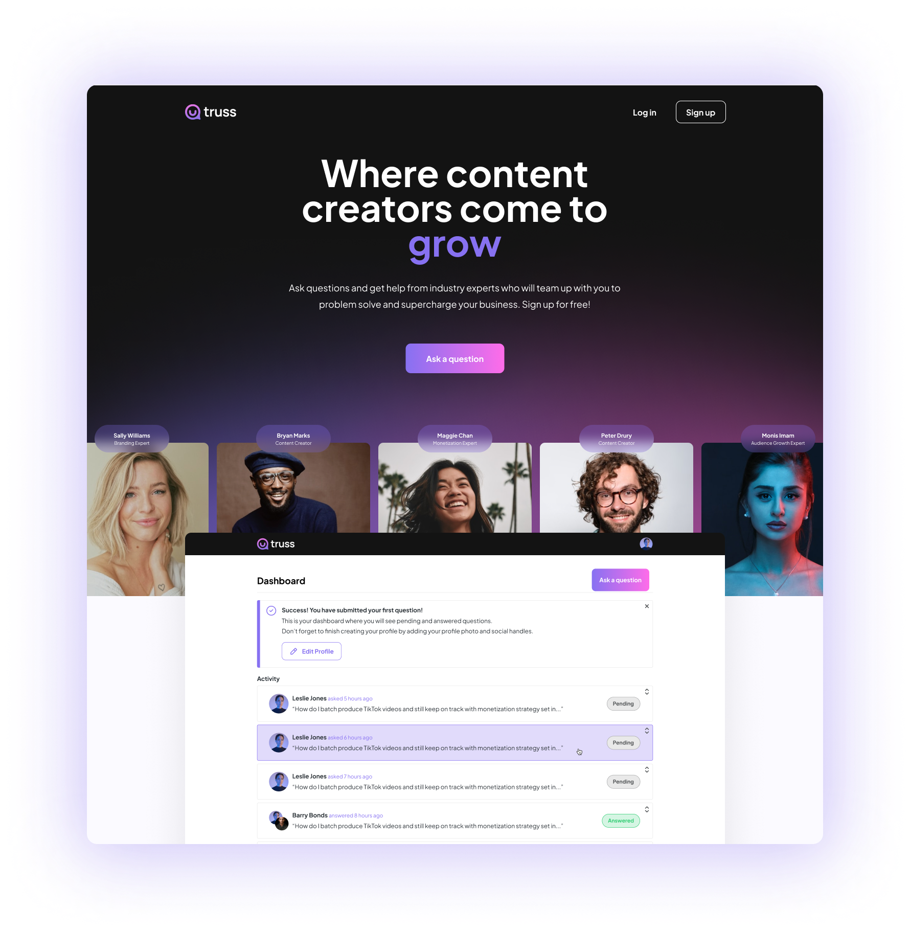
Final Landing Page
Expert Flow
Profile Page Development
Final Version
Onboarding
Profile Settings
Edit and Create Services
Payments
Inbound Requests (Messaging)
Sketching
Final Version
Early Iterations
Video Responses
Early Iterations
Final Version
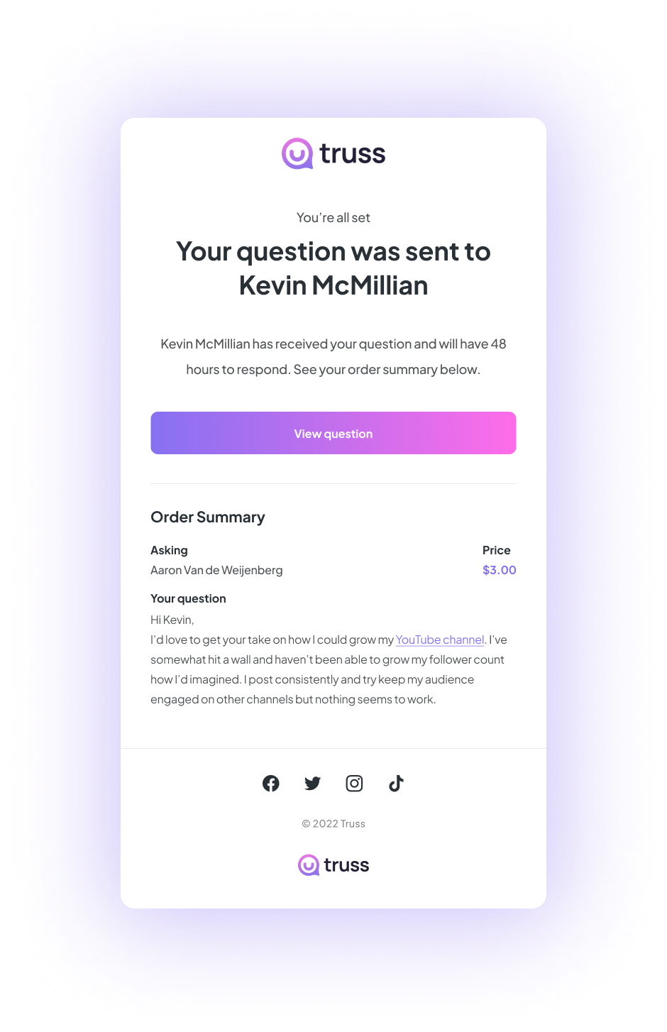
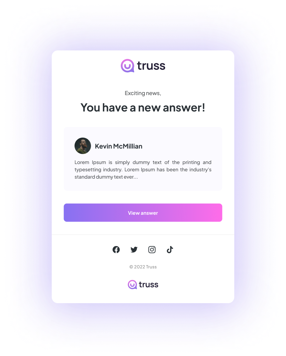
Email Design
Expert Social Assets
Closing Thoughts
We’re finally on the right track. The platform is seeing steady revenue week-over-week and my god does that feel good! After two long years, what feels like 100s of prototypes and MVPs we’ve reach product market fit. The work doesn’t stop there, we continue to build and improve on features.
Additionally, we can now put some real budget towards marketing the platform more effectively. One of the most rewarding aspects of this project is how many people are signing up to use the platform without truly putting substantial marketing dollars behind our efforts.
We aim to open out our target segments, we have found good signal in the up and coming high school and collegiate athletes.
If you have made it this far, THANK YOU… It means the world to me that you have taken the time to check out my work.
Onward!


