AI Outbound
Redesigning personalized outreach to feel human, not automated.
- Role
- End-to-end product design
- Timeline
- June 2026
- Team
- Product, Marketing, Engineering
- Company
- HoneyBook
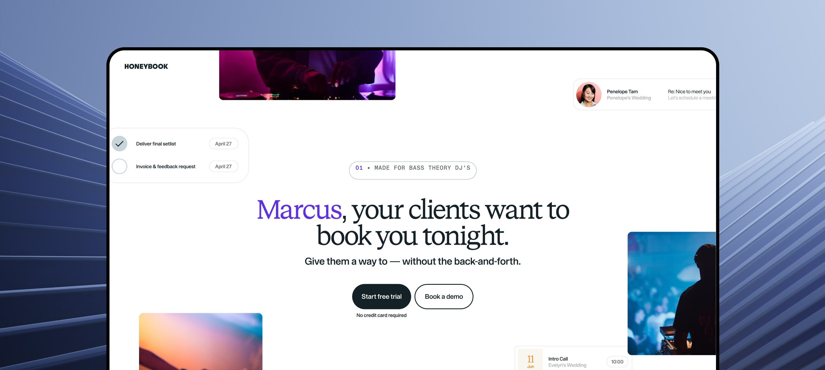
Overview
HoneyBook needed a way to reach high-value businesses that weren't actively shopping for new software.
I designed an AI-powered email and landing page system that personalized outreach at scale while staying consultative, not creepy.
My role
End-to-end product design: research, UX/UI, prototyping, and prompt engineering for AI-generated content.
I joined the project when the team already had an early direction for the experience. As I explored the problem, I felt the existing approach treated outreach too much like a traditional marketing page. It showed the right information, but it did not reflect how personal the interaction needed to feel.
Objective
Increase acquisition and activation of proven ICP verticals by creating a scalable, AI-powered outbound motion that could simulate personalized, human-grade consultative outreach at scale.
What we built
An outbound system, not just an email.
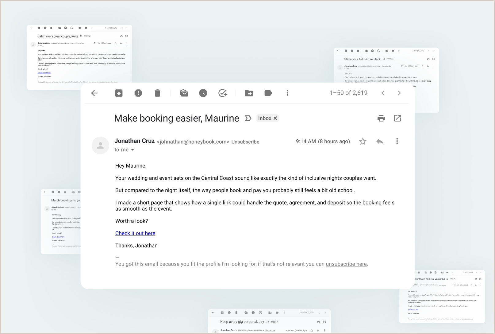
The system took existing ICP lead lists, enriched them to infer operational pain, and generated personalized email and landing page combinations.
The email created the opening.
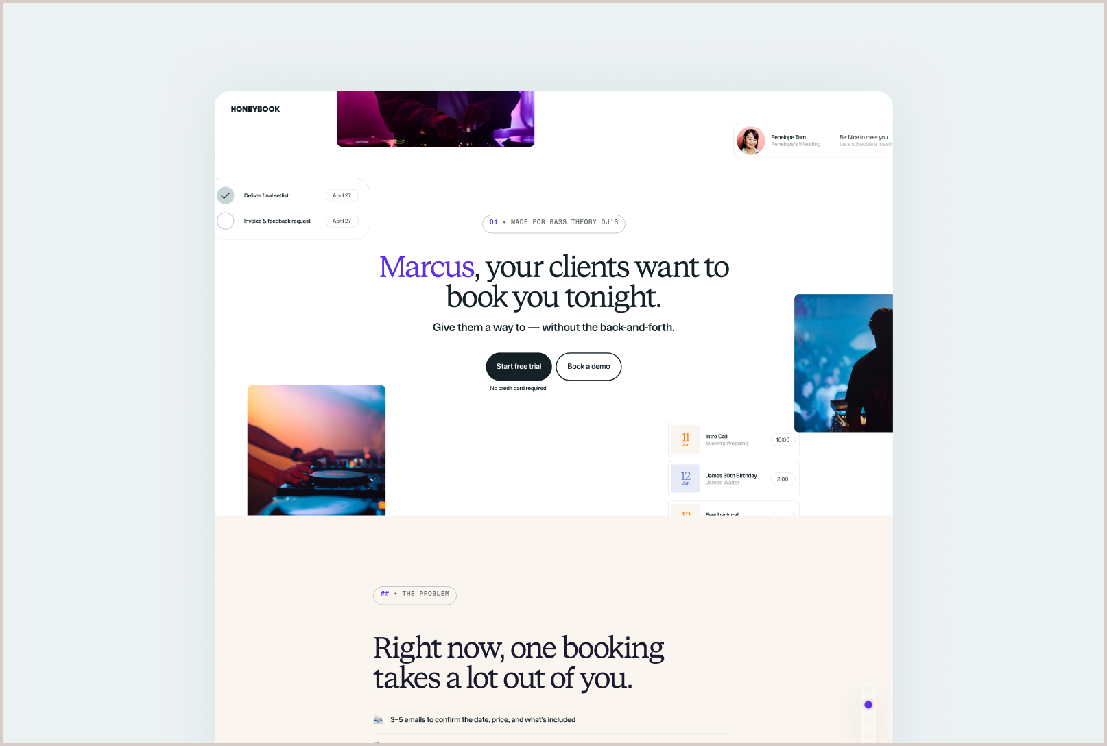
The landing page continued the conversation.
Together, they created a more consultative path from cold outreach to product discovery.
The problem
The original concept felt like AI was doing the selling.
The development team had already built an initial landing page using AI.
It had three problems:
The design looked obviously AI-generated.
There was no meaningful interactivity or movement.
The personalization felt invasive.
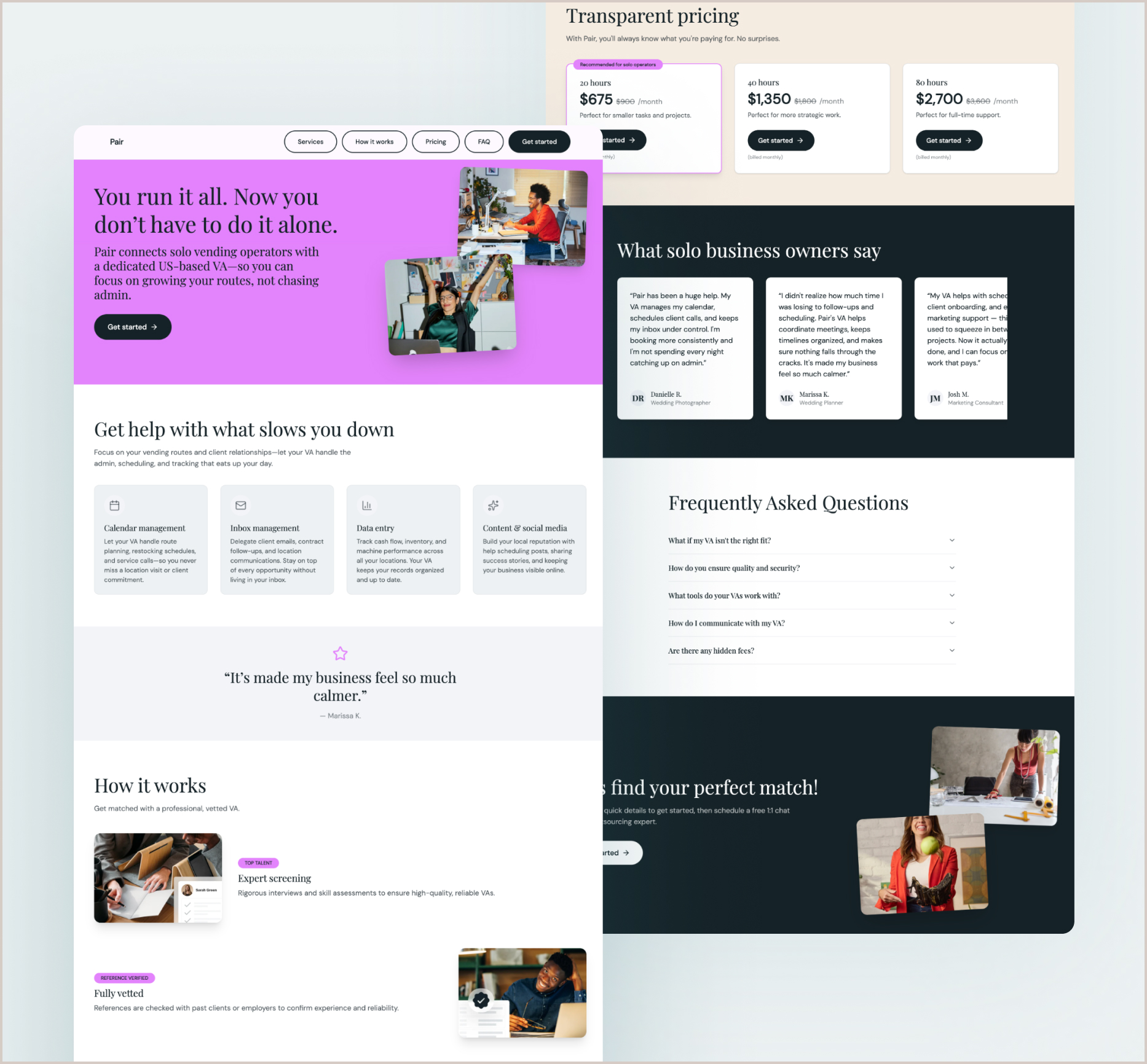
Using someone's name in a traditional marketing page made the experience feel less like someone reaching out and more like surveillance.
The challenge became bigger than designing an AI-generated page. How could we make personalized outreach feel thoughtful rather than creepy?
The shift
I wanted it to feel like a personalized deck, not a marketing page.
Since we'd be surfacing personal data, the experience needed to feel intentional and custom.
I looked for formats that could make personalized information feel useful rather than invasive. Two inspirations shaped the direction:
growth.design
Their case studies use a structured, modular format. Users move through slides, progress indicators show where they are, and the information is easy to scan. It feels more like an experience than marketing.
Spotify Wrapped
They take personal data and present it in a way that's engaging and easy to navigate. The format respects the reader's time and makes the experience feel thoughtful.
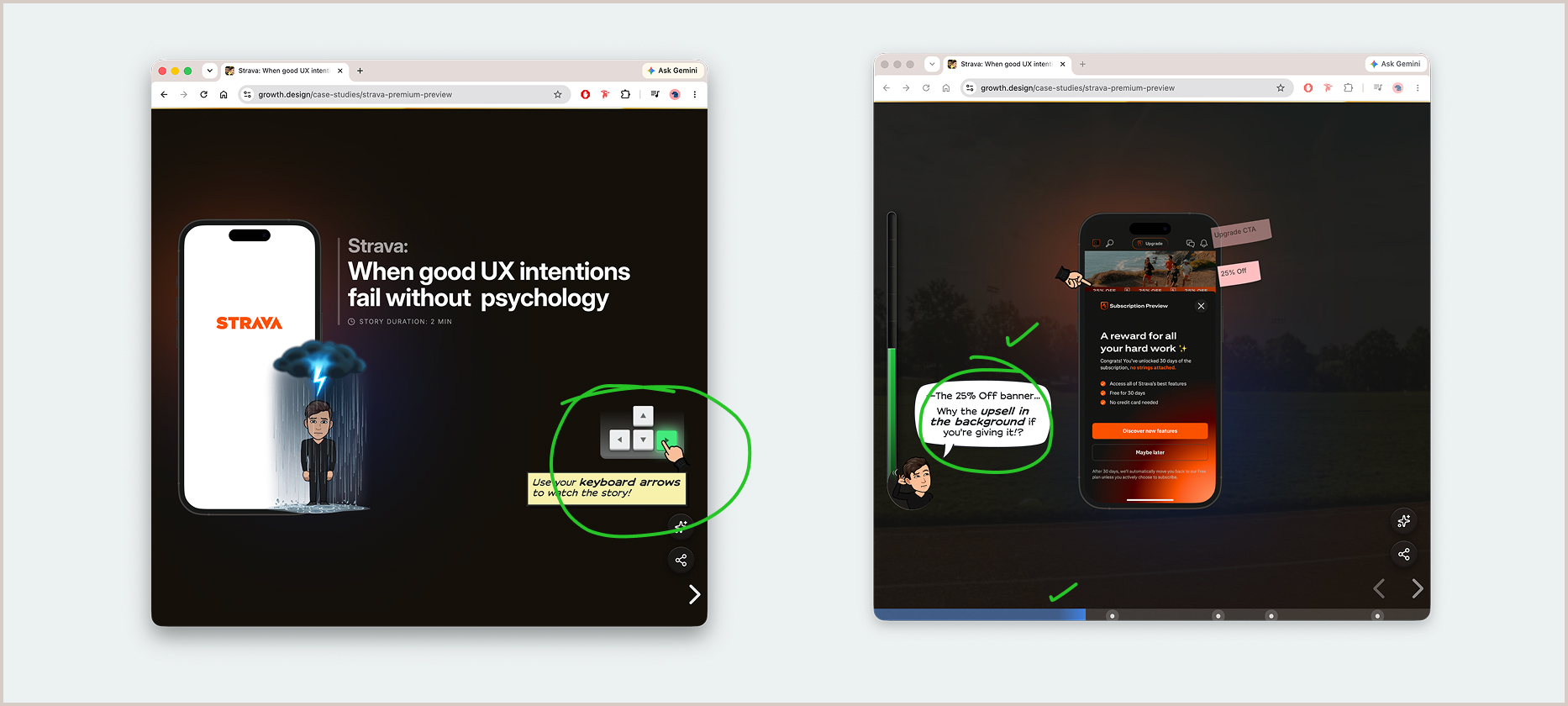
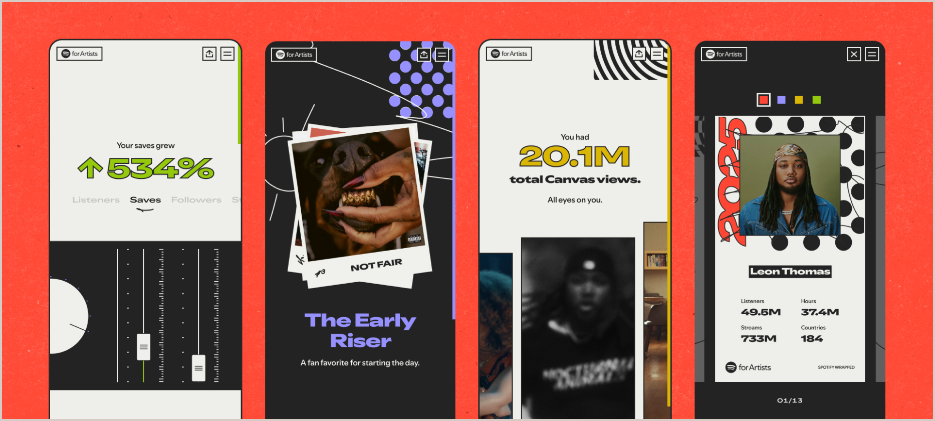
I challenged the existing direction and introduced a deck-based model instead.
Rather than presenting prospects with a long marketing page, the deck created a focused experience where they could move through a personalized story one idea at a time.
It gave the content more rhythm, made the interaction feel intentional, and created a structure that could adapt to different prospects without feeling like a generated template.
That concept became the foundation for the experience we moved forward with.
Email design
Lead with the pain, not the product.
I shaped the email approach by reviewing the initial versions and providing direction on tone, structure, and pain mapping.
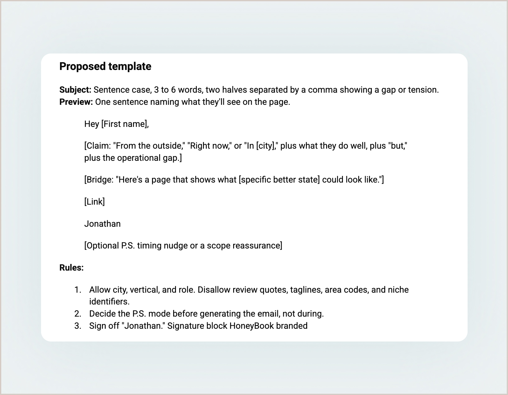
Design principles:
Pain-led, JTBD-oriented
Read like a founder or peer, not a SaaS team
Specific over impressive
Only use the recipient's name and inferred pain. No scraped personal data.
Four pain hooks:
Efficiency gaps
"What would 30 fewer admin minutes per booking feel like?"
Tool fragmentation
"Still quoting gigs in a spreadsheet?"
Admin burden
"Chasing Venmo payments after every event?"
Migration anxiety
"Switching feels risky. We can make it painless."
Email refinement
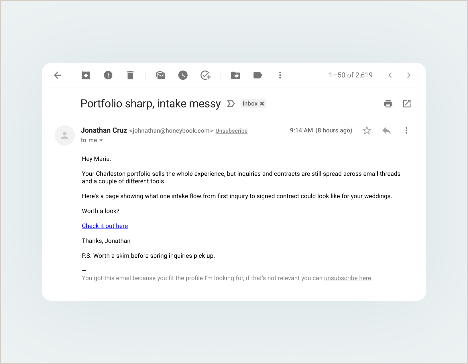
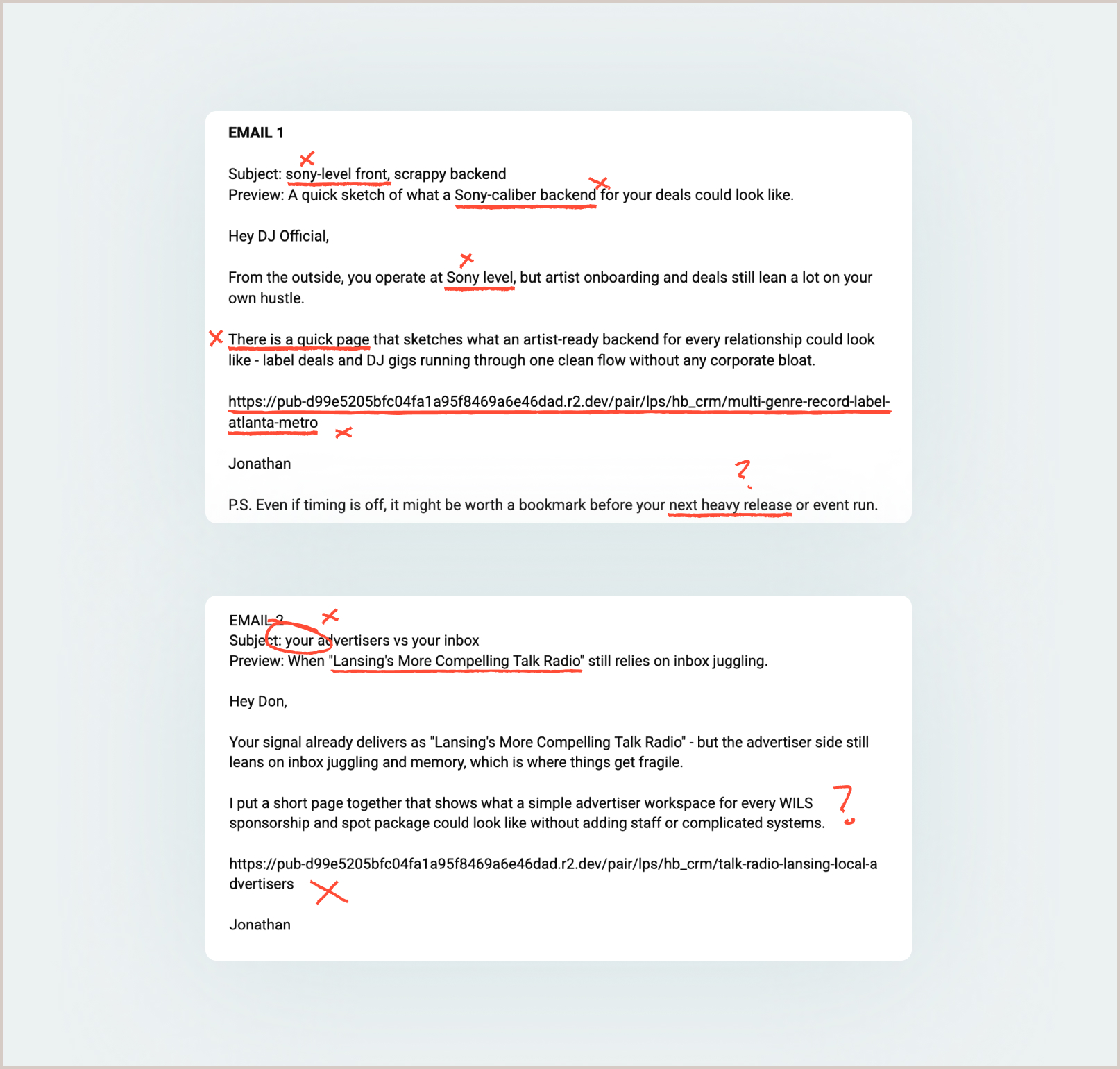
The first version was too data-heavy.
The initial emails all followed the same basic structure and forced the data into the message in ways that didn't feel human.
I shifted the approach from data-heavy to conversational.
The goal wasn't to prove how much we knew about someone. It was to show that we understood a real problem they might be experiencing.
Landing page
Personalization needed a better container.
The landing page carried the conversation forward from the email.
Instead of dropping someone onto a traditional marketing page filled with product claims, I designed it as a personalized deck.
The structure gave the experience a clear beginning, middle, and end while keeping the amount of information on screen intentionally focused.
IA + Figma
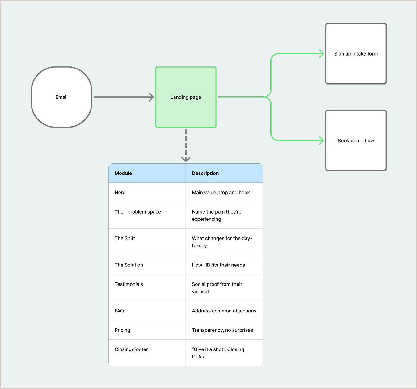
I designed the experience as a modular system.
I mapped the user journey through the page with an eight-module structure.
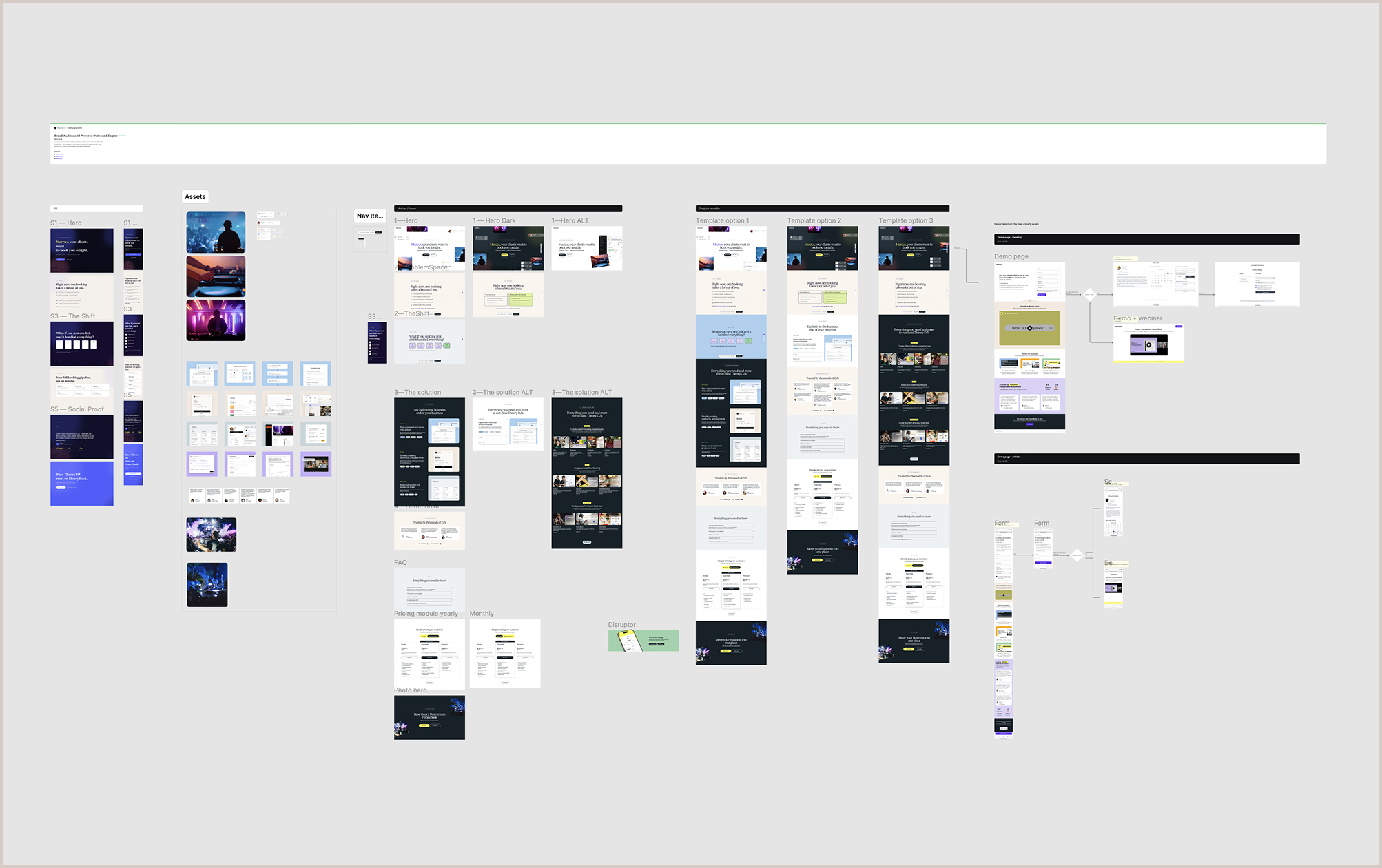
Then I moved to Figma to build modular components that could be reused, personalized, and tested in code before engineering started.
Claude Code
I used code to validate the experience before engineering.
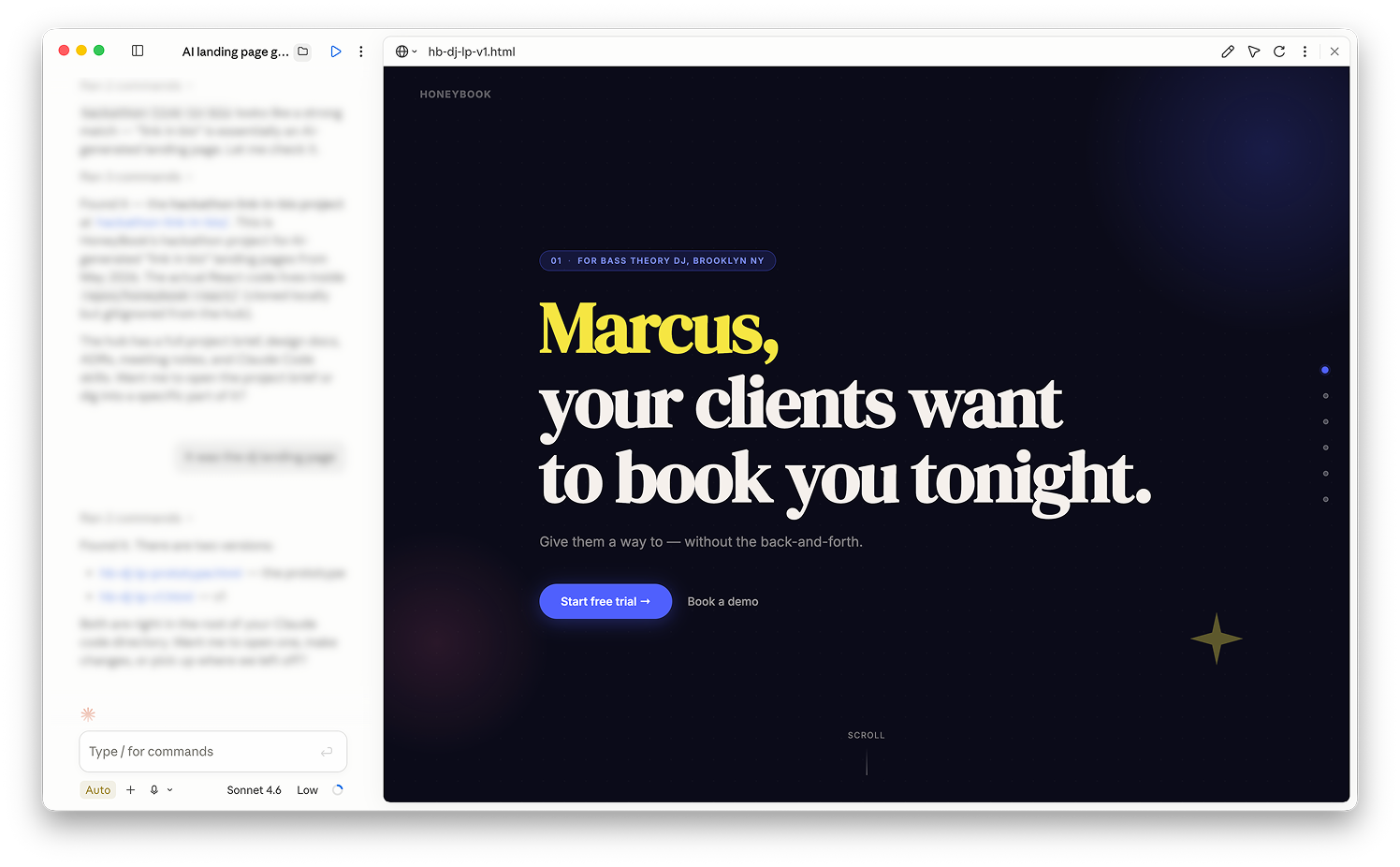
The interaction was difficult to communicate through static screens alone, so I moved beyond Figma and built the experience in Claude Code.
I started with rough HTML to establish the foundation, then layered in parallax and deck-like interactions. From there, I took each Figma module and iteratively refined them until I had a working prototype to share with the team.
Having a working prototype changed the conversation. Product, Marketing, and Engineering could experience the pacing, transitions, and personalization rather than trying to imagine them from a set of screens.
It allowed us to evaluate the idea earlier, identify problems faster, and align around the direction before investing heavily in implementation.
The prototype was not just a design deliverable. It became a tool for making decisions.

Shaping the direction
I helped turn an early AI-generated concept into a more human, credible, and scalable growth experience.
The experience sat at the intersection of Product, Marketing, AI, and Engineering, which meant decisions rarely belonged to one discipline.
I used prototypes and regular working sessions to keep those conversations grounded in the experience we were actually building. Instead of waiting for formal handoffs, we worked through questions together as the product evolved.
That helped us move faster while keeping the experience, technical constraints, and business goals connected.
Key design decisions
Every interaction had a job.
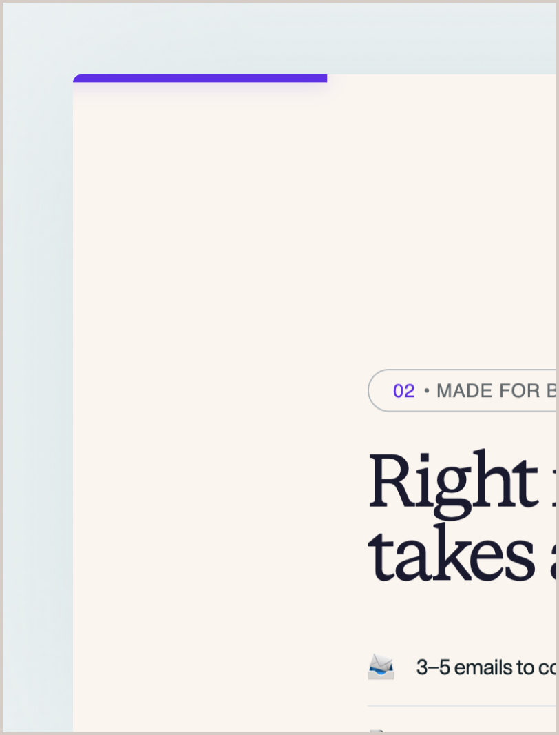
Scroll bar
Shows your position in the story. Gives momentum and makes the page feel finite rather than endless.
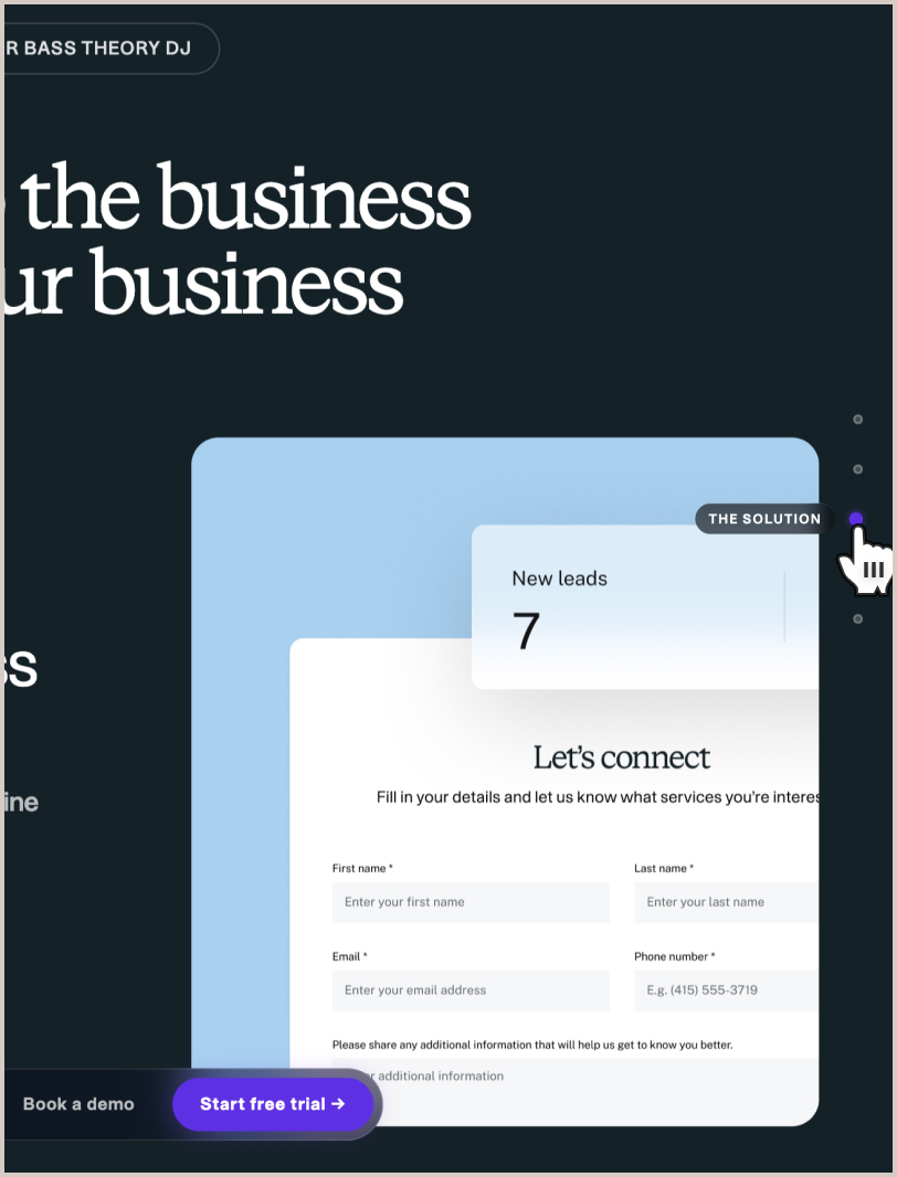
Side navigation
Lets people jump to the sections that matter to them. Power users can skip ahead without losing the narrative.
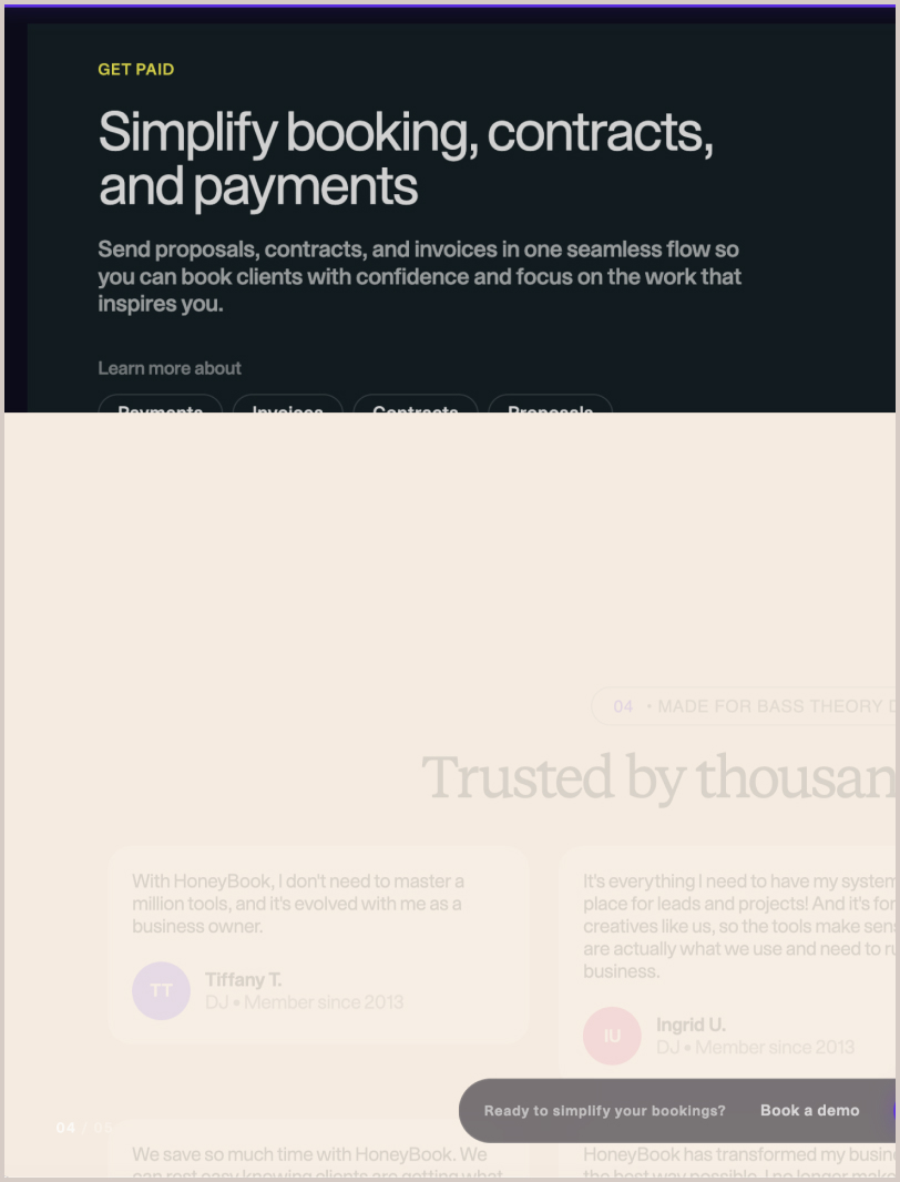
Parallax transitions
Creates depth as you scroll. Each section feels like turning a slide rather than reading a wall of text.
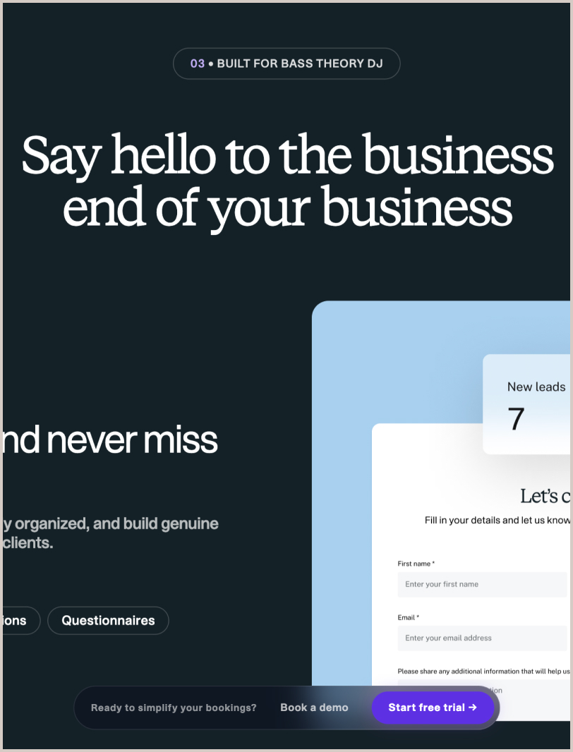
Fixed bottom CTA
Keeps trial and demo accessible throughout the experience while supporting conversion and accessibility.
Handoff + QA
The design didn't stop at handoff.
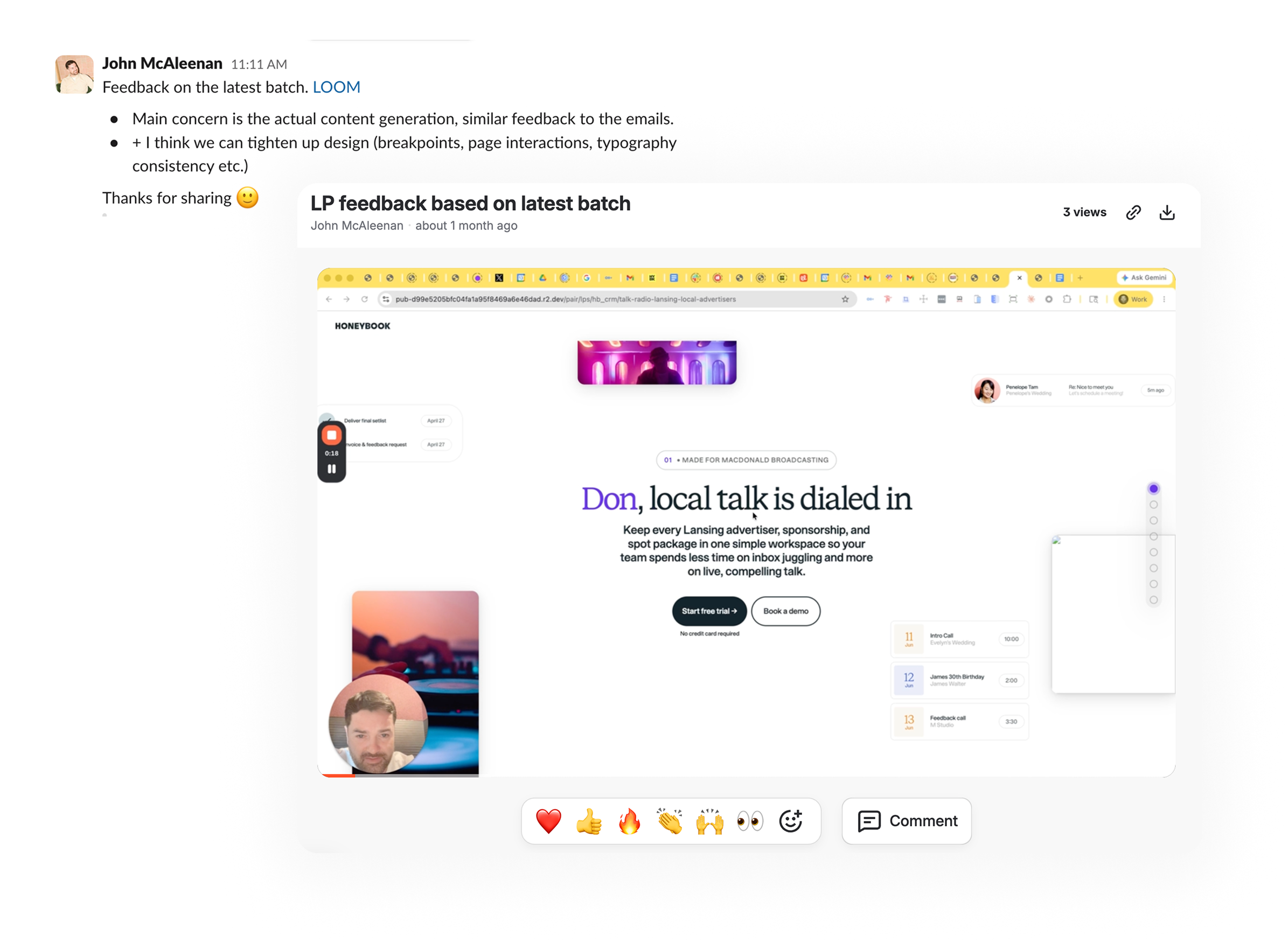
I handed off the working HTML from Claude Code with a detailed walkthrough demo.
As the team developed, I provided feedback through Loom. I recorded expected interactions, called out bugs, and showed exactly what needed to change.
I stayed close to implementation to keep the original design intent intact throughout the build.
Final design
A personalized growth experience that feels intentional.
The final experience moved significantly beyond the direction we started with. What began as an AI-generated marketing page became a more focused, personal way for businesses to introduce themselves to prospective customers.
The email earned attention.
The landing page continued the story.
The product gave the prospect a clear next step.
Early results
The first test showed a strong signal.
We launched a small batch test with 195 DJs to validate the approach before scaling.
The early numbers showed that the consultative, personalized strategy was resonating.
- 195
- Email sent
- 70
- Opened emails
- 38.6%
- Open rate
- 9
- Landing page visitors
- 7
- Email replies
Impact
Strong email engagement signaled that the pain-led, consultative approach was resonating.
Next steps
Expand to an additional DJ batch of 800 and proven ICP verticals.
Measure landing page conversion and trial-to-activation.
Track CAC against the paid baseline.
For me, the project also reinforced how much faster teams can learn when design moves beyond static artifacts. By making the experience real early, we were able to challenge assumptions, get the team aligned, and improve the product before implementation became expensive.